If you’re looking to invest in cryptocurrencies, it’s important that you know how to read the charts. In this blog post, we’ll teach you everything you need to know about how to read crypto charts! We’ll cover everything from how to identify trend lines to how to spot potential buy and sell signals. So whether you’re a beginner or an experienced investor, this guide will help you get a better understanding of how the cryptocurrency market works!
Quick Links to Useful Sections
- What Are Crypto Charts?
- How to Read Crypto Charts
- Where Can You Find Crypto Charts Online?
- What do the Different Elements of a Crypto Chart Mean?
- What Do The Red and Green Bars Mean With Crypto?
- What Do The Candles Mean in Crypto?
- How Do You Predict a Crypto Pump?
- How Do You Read Crypto RSI?
- What is a Green Dot on Crypto Charts?
- What is a Red Dot on Crypto Charts?
- What Does the Red Line Mean in Crypto?
- What Does the Green Line Mean in Crypto?
- What Does Minus Mean in Crypto?
- What Does Plus Mean in Crypto?
- What Are The Bars At The Bottom of a Crypto Chart?
- What is a Wick in Crypto?
- Why are Wicks Important?
- Do Candlestick Patterns Work in Crypto?
- Which Candle Stick Pattern is Bullish?
- What is The Best Candlestick Pattern to Trade?
- What is The Yellow Line on a Crypto Chart?
- What is The Blue Line on a Crypto Chart?
- What is The Purple Line on a Crypto Chart?
- Is RSI a Good Indicator for Crypto?
- What Are The Most Popular Crypto Trading Indicators?
- Moving Averages
- Relative Strength Index (RSI)
- Bollinger Bands
How to Read Crypto Charts: Everything You Need to Know Table of Contents
Where Can You Find Crypto Charts Online?
What do the Different Elements of a Crypto Chart Mean?
What Do The Red and Green Bars Mean With Crypto?
What Do The Candles Mean in Crypto?
How Do You Predict a Crypto Pump?
What is a Green Dot on Crypto Charts?
What is a Red Dot on Crypto Charts?
What Does the Red Line Mean in Crypto?
What Does the Green Line Mean in Crypto?
What Does Minus Mean in Crypto?
What Does Plus Mean in Crypto?
What Are The Bars At The Bottom of a Crypto Chart?
Do Candlestick Patterns Work in Crypto?
Which Candle Stick Pattern is Bullish?
What is The Best Candlestick Pattern to Trade?
What is The Yellow Line on a Crypto Chart?
What is The Blue Line on a Crypto Chart?
What is The Purple Line on a Crypto Chart?
What Are Crypto Charts?
Crypto charts are simply graphical representations of how the prices of various cryptocurrencies have changed over time. They can be used to track price changes in real-time, or to see how prices have fluctuated over a longer period of time. Crypto charts can be helpful for all kinds of investors, from those who are just starting out to those who have been investing in cryptocurrencies for years.
There are a few different types of crypto charts that you might encounter. The most basic type is a line chart, which simply plots the closing price of a cryptocurrency over time. This can be helpful for seeing how the price has changed over time, but it doesn’t give you much information about what was happening during the day-to-day fluctuations.
A more advanced type of chart is the candlestick chart. Candlestick charts provide more information than a line chart, including the opening and closing prices, as well as the high and low prices for the day. This can be helpful for seeing how volatile the market is and for spotting potential trend lines.
There are also a few different ways that crypto charts can be displayed. The most common way is to display them on a logarithmic scale, which simply means that each unit on the y-axis represents a certain percentage change from the previous price. For example, if the y-axis is labeled “log scale,” then a movement from $100 to $200 would be represented by the same distance as a move from $0.01 to $0.02. This can be helpful for seeing how the price has changed over time, but it’s not always the most intuitive way to read a chart.
Some charts also display the price on a linear scale, which simply means that each unit on the y-axis represents a certain dollar amount. For example, if the y-axis is labeled “linear scale,” then a movement from $100 to $200 would be represented by twice as much distance as a move from $0.01 to $0.02. This can be helpful for seeing how the price has changed in real-time, but it’s not always the most accurate way to track long-term trends.
How to Read Crypto Charts
Cryptocurrency charts can be extremely confusing at first glance. All those lines and candlesticks can be overwhelming for beginners. In this guide, we will show you how to read crypto charts like a pro.
First, let’s take a look at the different types of charts that you will encounter when trading cryptocurrencies. The most common type of chart is the Candlestick Chart. This chart shows the open, high, low, and close price for a given period of time.
One popular type of chart is the Line Chart. This chart only shows the closing prices for a given period of time.
Another popular crypto chart is the Bar Chart. This chart shows the open, high, low, and close price for a given period of time.
Now that you know the different types of charts, let’s take a look at how to read them. The first thing you will want to do is identify the trends. Trends can be either up or down. To determine the direction of the trend, you will want to look at the moving averages.
The next thing you will want to do is identify support and resistance levels. These are key areas where the price has difficulty breaking through. Once you have identified these levels, you can start to trade accordingly.
If you are just starting out, we recommend using a Line Chart or a Bar Chart. These charts are simpler and easier to understand than Candlestick Charts. As you become more experienced, you can start to use Candlestick Charts to get a better idea of the market.
Where Can You Find Crypto Charts Online?
There are a variety of websites that offer crypto charts. Some popular options include CoinMarketCap, CryptoCompare, and TradingView. Each website has its own strengths and weaknesses, so it’s worth trying out a few different ones to see which one you prefer.
What do the Different Elements of a Crypto Chart Mean?
Once you’ve found a crypto charting website that you’re happy with, it’s time to start learning how to read it. The first thing you’ll notice is that there are a lot of different elements on the screen. Here’s a quick rundown of what each of them means:
- The price axis: This shows the current price of the cryptocurrency being plotted on the chart.
- The time axis: This shows how long ago the price was recorded.
- The order book: This is a list of all buy and sell orders that have been placed for the cryptocurrency being plotted on the chart.
- The trade history: This is a record of all recent trades that have been made for the cryptocurrency being plotted on the chart.
- The candlestick: This is the most important element of a crypto chart, and it shows the open, close, high, and low prices for a specific time period.
Now that you know what all of the different elements on a crypto chart mean.
What Do The Red and Green Bars Mean With Crypto?
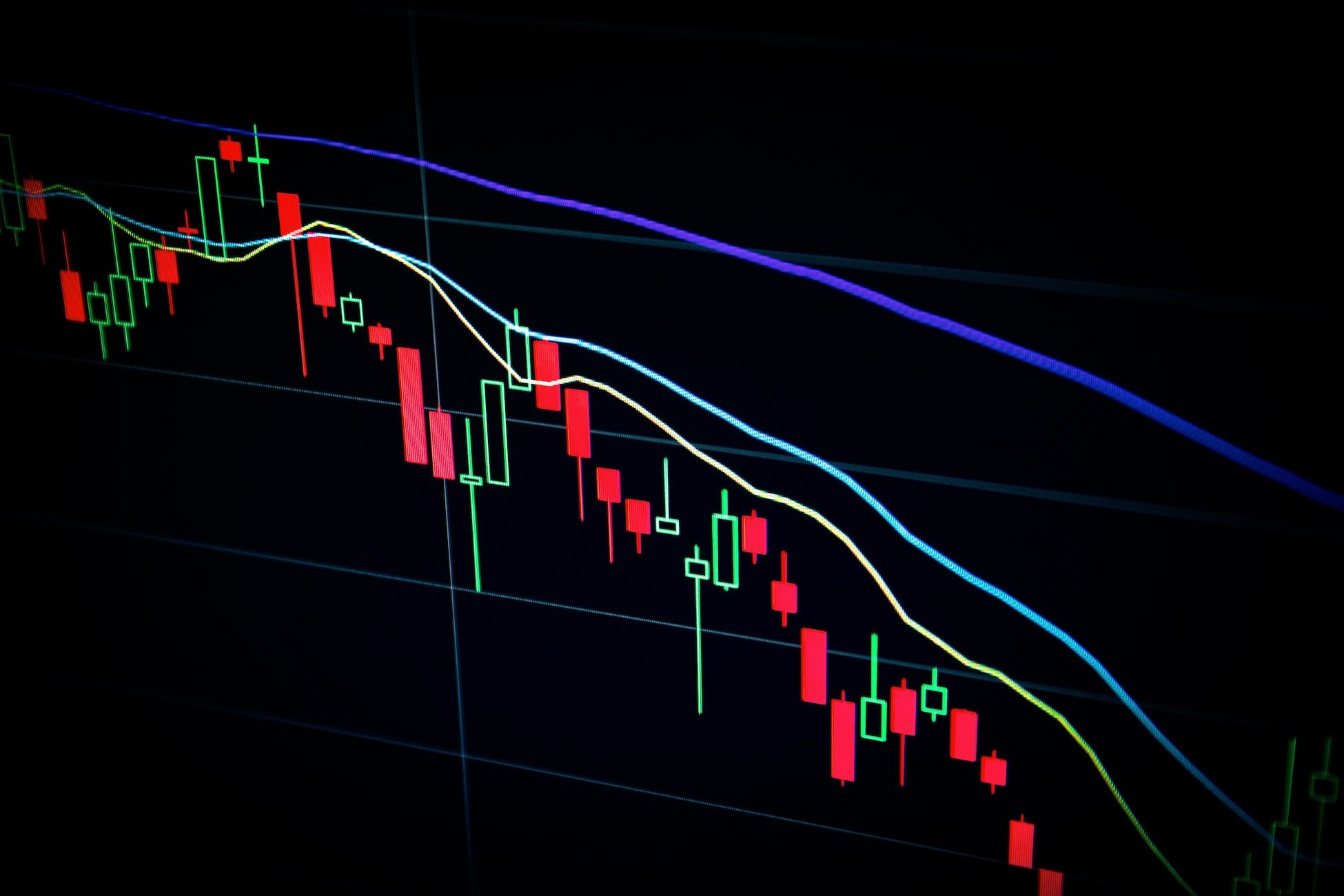
The red and green bars you see on a candlestick chart represent the opening and closing prices of that particular time period. The wicks show the high and low points reached during that time period. For example, if the candlestick is green, it means that the coin closed higher than it opened. Red would indicate the opposite.
If you’re looking at a line chart, things are a little different. The line simply connects the dots formed by each candlestick’s closing price. So, if most of the candlesticks are green, then you know that prices have been rising overall. If most are red, then prices have been falling.
You can also add technical indicators to your charts. These are mathematical formulas that use the price and volume data to generate buy and sell signals. Some popular indicators include moving averages, MACD, RSI, and Bollinger Bands.
There’s a lot of information that you can glean from crypto charts. By becoming proficient in reading them, you’ll be better equipped to make informed trading decisions.
What Do The Candles Mean in Crypto?
The first thing you need to know is that crypto charts display price action over time. Price action is how the price of an asset moves up or down in value. When you look at a chart, each “candle” represents a set period of time.
For example, on a one-minute chart, each candle represents one minute of price action. On a daily chart, each candle represents one day of price action. The time frame you choose will depend on your trading goals and timeframe.
The second thing you need to know is that the upper and lower parts of the candles represent the high and low prices for that period of time. The thin lines extending from the top and bottom of the candles are called “wicks.”
The wicks show you how high or low the price went during that period of time. The thicker part of the candle in the middle is called the “body.” The body shows you the opening and closing prices for that period of time.
If the body is green, it means the asset closed at a higher price than it opened. If the body is red, it means the asset closed at a lower price than it opened. If there is no body (just a thin line), it means the asset opened and closed at the same price (it was “unchanged”).
The third thing you need to know is that crypto charts can help you identify trends. A trend is simply a direction that the price is moving in.
If the price is moving up, we call it an “uptrend.” If the price is moving down, we call it a “downtrend.” And if the price is moving sideways, we call it a “consolidation phase.”
How Do You Predict a Crypto Pump?
There are a few key things to look for when trying to predict a cryptocurrency pump. First, you’ll want to keep an eye on social media. Look for posts about the coin you’re interested in and see if there is any unusual activity.
Next, you’ll want to check the trading volume of the coin. If there is a sudden increase in trading volume, that could be a sign that a pump is about to occur.
Finally, you’ll want to monitor the price action of the coin itself. If the price starts rising rapidly, that’s usually a good indication that a pump is happening.
With these three things in mind, you should be able to predict crypto pumps with pretty good accuracy.
How Do You Read Crypto RSI?
The RSI, or Relative Strength Index, is a momentum indicator that measures how fast price is moving in relation to itself. The RSI can be used to identify overbought and oversold conditions, as well as potential reversals.
When the RSI is above 70, it is considered overbought, and when it is below 30, it is considered oversold. However, these levels can vary depending on the market conditions.
The best way to use the RSI is in conjunction with other indicators and chart patterns. For example, if you see a bearish divergence (price making new highs but the RSI making lower highs), that could be a sign that price is about to reverse lower.
What is a Green Dot on Crypto Charts?
A green dot on a crypto chart indicates an up-tick in price. In other words, the market is currently bullish on that particular cryptocurrency. If you’re looking at a one-hour chart, for example, a green dot means that the price has gone up in the last hour.
Of course, it’s not always as simple as that. Different exchanges use different colors to represent different things, so you’ll need to pay attention to the legend on your particular charting platform. But in general, a green dot means that the market is currently bullish on that particular cryptocurrency.
What is a Red Dot on Crypto Charts?
A red dot on a crypto chart indicates a down-tick in price. In other words, the market is currently bearish on that particular cryptocurrency. If you’re looking at a one-hour chart, for example, a red dot means that the price has gone down in the last hour.
As with green dots, different exchanges use different colors to represent different things. So again, you’ll need to pay attention to the legend on your particular charting platform. But in general, a red dot means that the market is currently bearish on that particular cryptocurrency.
What Does the Red Line Mean in Crypto?
The red line on a crypto chart is the price action. It shows how the price has been moving over a certain period of time. The thicker the line, the more significant the move.
A red line that is rising indicates that the price is going up. A red line that is falling indicates that the price is going down.
What Does the Green Line Mean in Crypto?
The green line on a crypto chart is the volume. It shows how many coins have been traded over a certain period of time. The thicker the line, the more significant the volume.
A green line that is rising indicates that more coins are being traded. A green line that is falling indicates that fewer coins are being traded.
What Does Minus Mean in Crypto?
When you see a minus sign (-) on a crypto chart, it typically means one of two things. It can either indicate that the price of the asset is currently down from the opening price, or it can represent a negative trend. In order to determine which one it is, you’ll need to look at the context of the chart.
If the minus sign is next to the opening price, then it indicates that the price is currently down from where it opened. If there’s a series of minus signs next to each other, this typically indicates a negative trend.
What Does Plus Mean in Crypto?
Plus signs (+) have a similar meaning to minus signs, but obviously in the opposite way.
A plus sign next to the opening price indicates that the asset is currently up from where it opened. And a series of plus signs next to each other typically indicates a positive trend.
What Are The Bars At The Bottom of a Crypto Chart?
The first thing you need to know about reading crypto charts is what those bars at the bottom represent. Each one of those represents how much trading activity took place during that particular time period. The wider the bar, the more trading activity that took place. And vice versa, the thinner the bar, the less trading activity that occurred.
What is a Wick in Crypto?
A wick in crypto is simply a line on a candlestick chart that extends above or below the body of the candlestick. The wicks show the highest and lowest prices that were traded during the time period represented by the candlestick.
Why are Wicks Important?
Wicks are important because they give traders information about how price action is playing out within a certain time frame. For example, if there is a long upper wick on a candlestick, it shows that buyers tried to push prices higher but were ultimately unsuccessful. This can be an indication that bears are starting to take control of price action.
Similarly, if there is a long lower wick on a candlestick, it shows that sellers tried to push prices lower but were ultimately unsuccessful. This can be an indication that bulls are starting to take control of price action.
In general, long wicks can be an indication of a change in market sentiment. When combined with other technical indicators, they can provide valuable information about how price action is likely to play out in the future.
Do Candlestick Patterns Work in Crypto?
This is a question that gets asked a lot, and unfortunately, there isn’t a easy answer. Candlestick patterns are created by human emotions and can be found in any financial market. When it comes to crypto, candlestick patterns can give you an idea of what traders are thinking and how they might trade in the future.
However, it’s important to remember that no one pattern is 100% accurate. There are always going to be false signals with any pattern. The best way to use candlestick patterns is to combine them with other forms of technical analysis, such as support and resistance levels or moving averages. This will help increase your chances of making profitable trades.
Which Candle Stick Pattern is Bullish?
There are many different types of chart patterns that can be used to predict price movements in the market.
However, not all of these patterns are equally effective at predicting bullish or bearish price movements. Some of the most popular and reliable bullish candlestick patterns include the hammer, inverted hammer, morning star, and Piercing Line patterns.
These patterns are typically characterized by a long lower shadow and a small real body, which indicates that buyers were able to push prices higher despite significant selling pressure. If you see one of these patterns forming on a crypto chart, it’s generally a good idea to take a long position in the market.
On the other hand, some of the most bearish candlestick patterns include the shooting star, dark cloud cover, and bearish engulfing pattern.
These patterns are typically characterized by a long upper shadow and a small real body, which indicates that sellers were able to push prices lower despite significant buying pressure. If you see one of these patterns forming on a crypto chart, it’s generally a good idea to take a short position in the market.
Of course, candlestick patterns are just one tool that traders can use to make decisions in the market. It’s important to remember that no single indicator is perfect, and that all indicators should be used in conjunction with other forms of analysis before making any trading decisions.
What is The Best Candlestick Pattern to Trade?
This is a question that every trader needs to ask themselves. There are many candlestick patterns out there and it can be tough to know which one will work the best. In this article, we will go over some of the most popular candlestick patterns and how you can use them when trading cryptocurrencies.
The first pattern that we will look at is the doji. This is a very popular pattern and it is used by many traders. The doji has a small body with long wicks on both sides. This shows that there is a lot of indecision in the market and that the market is struggling to find direction. When you see this pattern, you should be prepared for a potential reversal in the market.
Another popular pattern is the engulfing pattern. This is a two-candlestick pattern that shows a strong move in one direction. The first candlestick is small and the second candlestick is much larger. This shows that there is a lot of buying pressure in the market and that the market is likely to continue moving in this direction.
The last pattern that we will look at is the hammer. This is a single-candlestick pattern that shows a potential reversal in the market. The hammer has a small body with a long wick on the bottom. This shows that there was selling pressure in the market but that buyers were able to push the price back up. If you see this pattern, you should be prepared for a potential reversal in the market.
These are just three of the most popular candlestick patterns. There are many others out there that you can use when trading cryptocurrencies. The best way to find the right pattern is to experiment and see what works best for you. Try different patterns and see how they work in different situations. With enough practice, you will be able to read crypto charts like a pro!
What is The Yellow Line on a Crypto Chart?
The yellow line on a crypto chart is the price action. This is what tells you how the market is moving and what prices to expect. When you are looking at a chart, the yellow line shows you how the market has moved in the past and how it is expected to move in the future. You can use this information to make predictions about where the market is headed and how to trade accordingly.
What is The Blue Line on a Crypto Chart?
The blue line on a crypto chart is called the price action. This is how much the price of a coin has moved in a given period of time. The longer the timeframe, the more significant the move.
What is The Purple Line on a Crypto Chart?
The purple line on a crypto chart is the moving average convergence divergence (MACD). This technical indicator is used to measure the strength of a trend.
The MACD is calculated by subtracting the 26-period exponential moving average (EMA) from the 12-period EMA. The resulting line is then plotted on top of a signal line, which is simply a nine-period EMA of the MACD line. When the MACD crosses above the signal line, it’s a bullish sign, and when it crosses below the signal line, it’s a bearish sign.
The MACD can also be used to generate buy and sell signals. A commonly used technique is to look for divergences between the MACD and the price action. A bullish divergence occurs when the MACD line forms two higher lows, while the price action forms two lower lows. This is a sign that the downward trend is losing momentum and that a reversal may be in store.
On the other hand, a bearish divergence takes place when the MACD line forms two lower highs, while the price action creates two higher highs. This signals that the upward trend is losing steam and that a sell-off may be on the horizon.
The MACD isn’t perfect, however, as false signals can occur from time to time. As such, it’s important to use other technical indicators in conjunction with the MACD to confirm any potential buy or sell signals.
Is RSI a Good Indicator for Crypto?
One indicator that is often used by crypto traders is RSI, or Relative Strength Index. This technical analysis tool measures the strength of a crypto asset’s price movement over time. The index ranges from 0 to 100, with readings below 30 indicating an oversold condition and readings above 70 indicating an overbought condition. Many traders use RSI as a buy or sell signal, but it’s important to keep in mind that this indicator should be used in conjunction with other technical indicators and fundamental analysis.
What Are The Most Popular Crypto Trading Indicators?
There are a few different types of indicators that traders use to read crypto charts. Some of the most popular indicators include moving averages, Relative Strength Index (RSI), and Bollinger Bands.
Let’s take a closer look at each of these indicators:
Moving Averages
A moving average is simply the average price of an asset over a certain period of time. For example, if the moving average is set at 20 days, it will take the past 20 days’ worth of data points and calculate the average price.
This indicator is used to smooth out price action and help traders identify trends more easily. When the price is above the moving average, it indicates an uptrend, while a price below the moving average indicates a downtrend.
There are different types of moving averages, including simple, exponential, and weighted moving averages. Each type has its own advantages and disadvantages, so it’s important to experiment with different settings to see what works best for you.
Relative Strength Index (RSI)
The Relative Strength Index (RSI) is a momentum indicator that measures how overbought or oversold an asset is. An RSI above 70 indicates that an asset is overbought and may be due for a correction, while an RSI below 30 indicates that an asset is oversold and could be due for a rally.
Bollinger Bands
Bollinger Bands are a technical indicator that consists of three lines: an upper line, a lower line, and a middle line. The middle line is simply a moving average, while the upper and lower lines are calculated using standard deviations.
Bollinger Bands can be used to identify overbought or oversold conditions, as well as potential breakouts from ranges. When the price is trading close to the upper Bollinger Band, it may be due for a correction. Similarly, when the price is trading close to the lower Bollinger Band, it could be due for a rally.
These are just some of the most popular indicators that traders use to read crypto charts. Experiment with different indicators and settings to see what works best for you. And remember, the best way to learn is by practicing in a demo account before risking any real money.


